© 2024 MIN HEONG HONG
SEOUL–NEW YORK
MENU
MENU
/
WORK
/
COLLEB
UX/UI Design
COLLEB
COLLEB
PROJECT TYPE
Solo Project
Solo Project
SOFTWARE
Figma, Photoshop,
Illustrator
Figma, Photoshop,
Illustrator
DURATION
5 Weeks
5 Weeks
Role
Research / Design 100%
Research / Design 100%
DELIVERABLES
App
App
overview
Colleb is an exclusive college student matching app that helps students connect with like-minded collaborators beyond their immediate circle based on personality and skills. By prioritizing compatibility, students can review portfolios of others with similar tastes, relevant skills for a project, and availability to simplify the collaboration and recruitment process.
Colleb is an exclusive college student matching app that helps students connect with like-minded collaborators beyond their immediate circle based on personality and skills. By prioritizing compatibility, students can review portfolios of others with similar tastes, relevant skills for a project, and availability to simplify the collaboration and recruitment process.


BACKGROUND
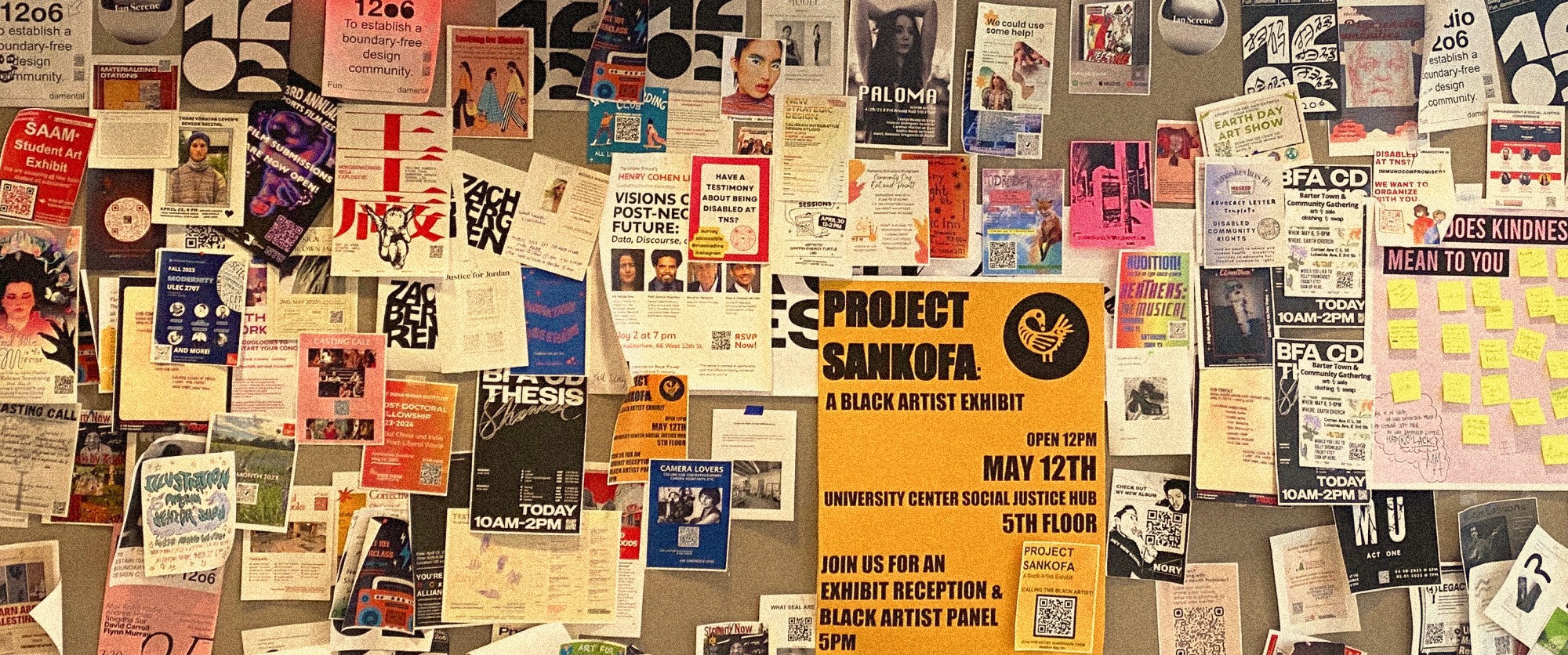
Can Flyers Really Help You Find Collaborators for Projects?
Can Flyers Really Help You Find Collaborators for Projects?
Can Flyers Really Help You Find Collaborators for Projects?
I started this project because I was curious about how useful the flyers on U.S. college campuses hallways are for helping students find teammates. My curiosity came from my cultural background, where students mainly rely on online communities to connect and collaborate.
I started this project because I was curious about how useful the flyers on U.S. college campuses hallways are for helping students find teammates. My curiosity came from my cultural background, where students mainly rely on online communities to connect and collaborate.
I started this project because I was curious about how useful the flyers on U.S. college campuses hallways are for helping students find teammates. My curiosity came from my cultural background, where students mainly rely on online communities to connect and collaborate.
observation 01
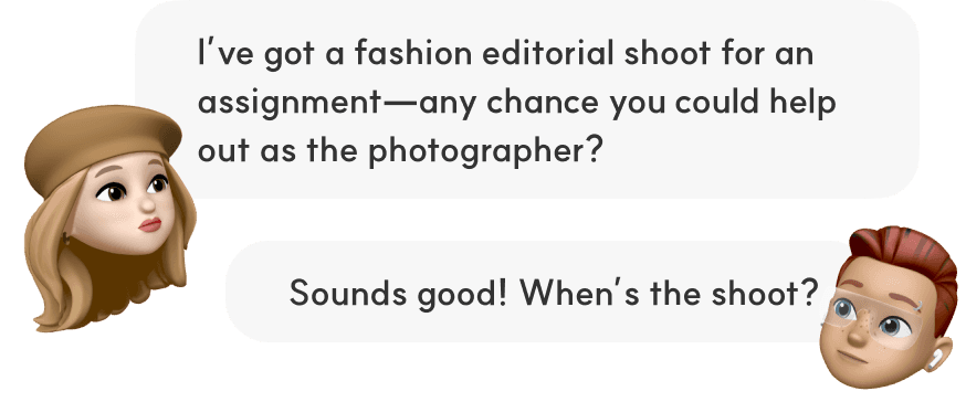
Teammates Found Within Personal Networks
Teammates Found Within Personal Networks
Teammates Found Within Personal Networks
After observing how students around me look for team members, I noticed that most rely on asking friends or using social media to find teammates within their personal networks.
After observing how students around me look for team members, I noticed that most rely on asking friends or using social media to find teammates within their personal networks.
After observing how students around me look for team members, I noticed that most rely on asking friends or using social media to find teammates within their personal networks.
observation 02

South Korean college student online community apps
Left: Everytime; 7M+ users (as of 2024) / Right: Campus Pick; 3M+ monthly users (as of 2022)
Lack of College-specific Online Communities for U.S. Students
Lack of College-specific Online Communities for U.S. Students
Lack of College-specific Online Communities for U.S. Students
In Korea, college students have access to many opportunities through active online communities. However, I noticed that these kinds of communities are less active in the U.S., which limits the range of opportunities available.
In Korea, college students have access to many opportunities through active online communities. However, I noticed that these kinds of communities are less active in the U.S., which limits the range of opportunities available.
In Korea, college students have access to many opportunities through active online communities. However, I noticed that these kinds of communities are less active in the U.S., which limits the range of opportunities available.
PROBLEM STATEMENT
How might I help college students find their like-minded collaborators beyond their limited network?
How might I help college students find their like-minded collaborators beyond their limited network?
How might I help college students find their like-minded collaborators beyond their limited network?
solution
A Student Matching App Designed Exclusively for Collaboration
A Student Matching App Designed Exclusively for Collaboration
COLLEB is an app designed exclusively for students seeking collaboration opportunities. It allows users to easily browse others' work and recommends like-minded peers based on their styles, personalities, and skills.
COLLEB is an app designed exclusively for students seeking collaboration opportunities. It allows users to easily browse others' work and recommends like-minded peers based on their styles, personalities, and skills.
COLLEB is an app designed exclusively for students seeking collaboration opportunities. It allows users to easily browse others' work and recommends like-minded peers based on their styles, personalities, and skills.
Research Method
Quantitative Research—Google Form
31 Participants (U.S. college students who have posted recruitment flyers / searched for teammates for collaboration)
research FINDINGS
01
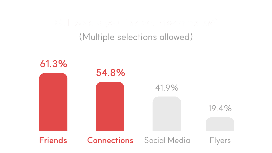
Students primarily found teammates through friends or personal connections.
01
Students primarily found teammates through friends or personal connections.
01
Students primarily found teammates through friends or personal connections.
Due to short project timelines, students mostly found teammates within immediate circles, and the likelihood of finding teammates through flyers was the lowest.
Due to short project timelines, students mostly found teammates within immediate circles, and the likelihood of finding teammates through flyers was the lowest.
Due to short project timelines, students mostly found teammates within immediate circles, and the likelihood of finding teammates through flyers was the lowest.
02
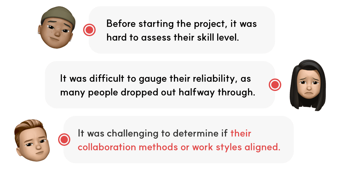
Why people chose acquaintances: It was easier to check their qualifications and know if their personality would lend itself to collaboration.
02
Why people chose acquaintances: It was easier to check their qualifications and know if their personality would lend itself to collaboration.
02
Why people chose acquaintances: It was easier to check their qualifications and know if their personality would lend itself to collaboration.
Personality differences tend to show up after collaboration begins, which makes it stressful to find trustworthy teammates.
Personality differences tend to show up after collaboration begins, which makes it stressful to find trustworthy teammates.
Personality differences tend to show up after collaboration begins, which makes it stressful to find trustworthy teammates.
03
However, students still had difficulty finding teammates because of their limited networks.
03
However, students still had difficulty finding teammates because of their limited networks.
03
However, students still had difficulty finding teammates because of their limited networks.
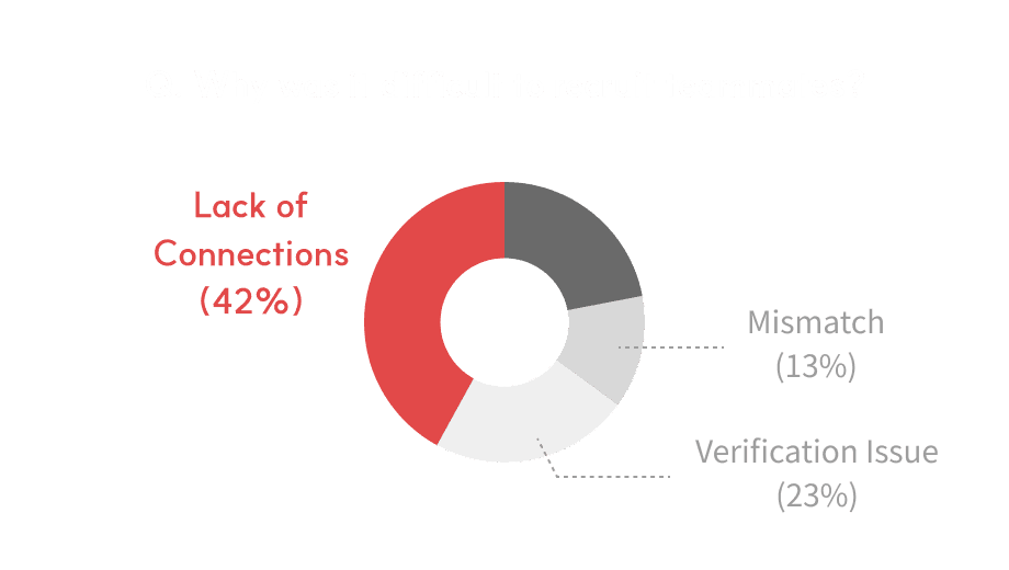
The research shows that 90% of respondents said they struggled even more because they didn’t know many people within their limited network.
The research shows that 90% of respondents said they struggled even more because they didn’t know many people within their limited network.
The research shows that 90% of respondents said they struggled even more because they didn’t know many people within their limited network.


HYPOTHESIS
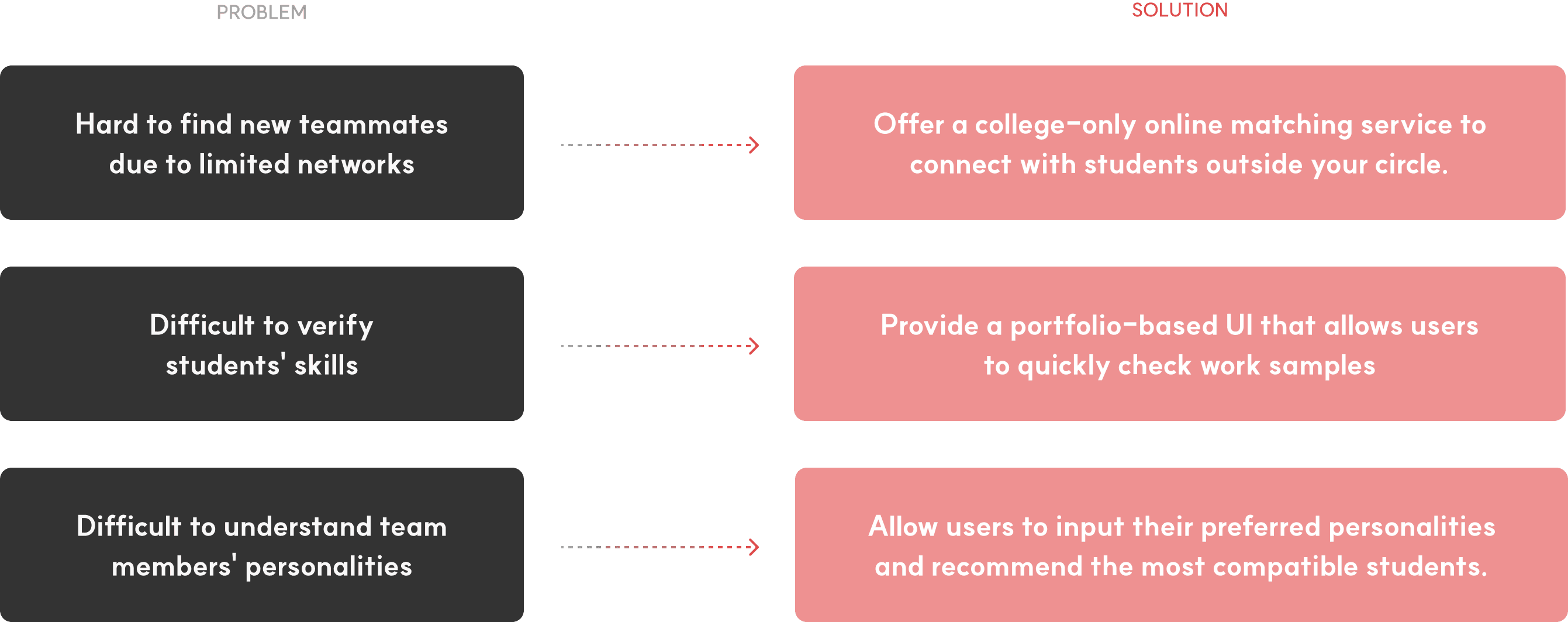
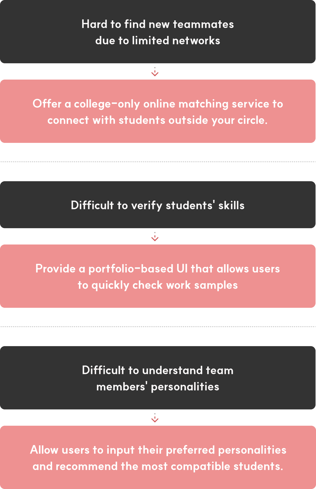
If an online matching pool allows students to view each other's skills and personalities in advance, it will effectively improve the teammate search process.
If an online matching pool allows students to view each other's skills and personalities in advance, it will effectively improve the teammate search process.

UI COncept
To help students save time finding collaborators, I decided to leverage familiar mental models that require no additional guidance to learn. I identified the main keywords for this platform as 'Matching' and 'Gen Z (students)' to pinpoint existing mental models.
To help students save time finding collaborators, I decided to leverage familiar mental models that require no additional guidance to learn. I identified the main keywords for this platform as 'Matching' and 'Gen Z (students)' to pinpoint existing mental models.
To help students save time finding collaborators, I decided to leverage familiar mental models that require no additional guidance to learn. I identified the main keywords for this platform as 'Matching' and 'Gen Z (students)' to pinpoint existing mental models.
01
'Matching' → Dating App → Swiping
01
'Matching' → Dating App → Swiping
01
'Matching' → Dating App → Swiping






02
'Gen Z (students)' → Social Media → Short Form
02
'Gen Z (students)' → Social Media → Short Form
02
'Gen Z (students)' → Social Media → Short Form
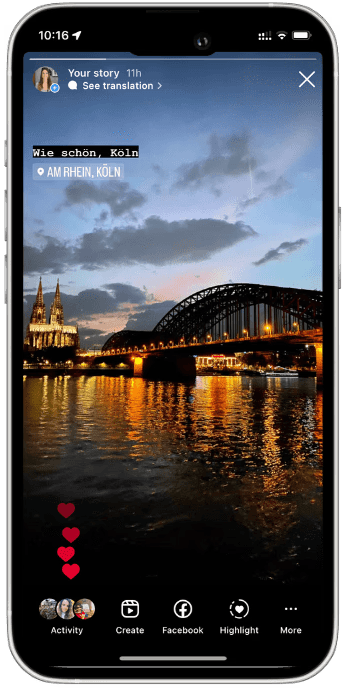
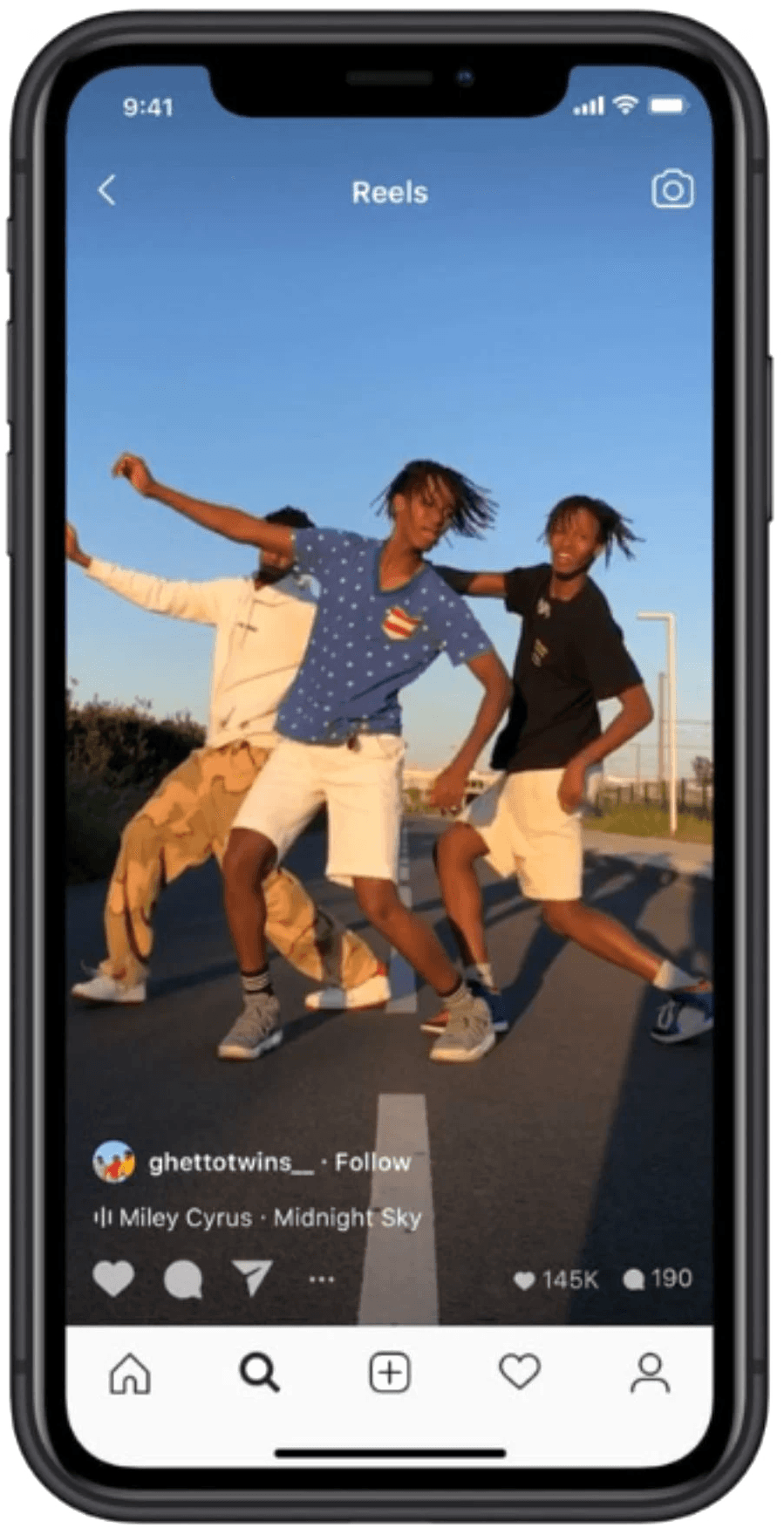
About 80% of Gen Z use social media platforms like YouTube, Instagram, and TikTok. To capitalize on this trend, I chose to use the 'Instagram Story' format to showcase multiple works instead of using Reels, which focus on a single work.
About 80% of Gen Z use social media platforms like YouTube, Instagram, and TikTok. To capitalize on this trend, I chose to use the 'Instagram Story' format to showcase multiple works instead of using Reels, which focus on a single work.
About 80% of Gen Z use social media platforms like YouTube, Instagram, and TikTok. To capitalize on this trend, I chose to use the 'Instagram Story' format to showcase multiple works instead of using Reels, which focus on a single work.
* Source: eMarketer




Iterations
01
Matching Screen
01
Matching Screen
01
Matching Screen
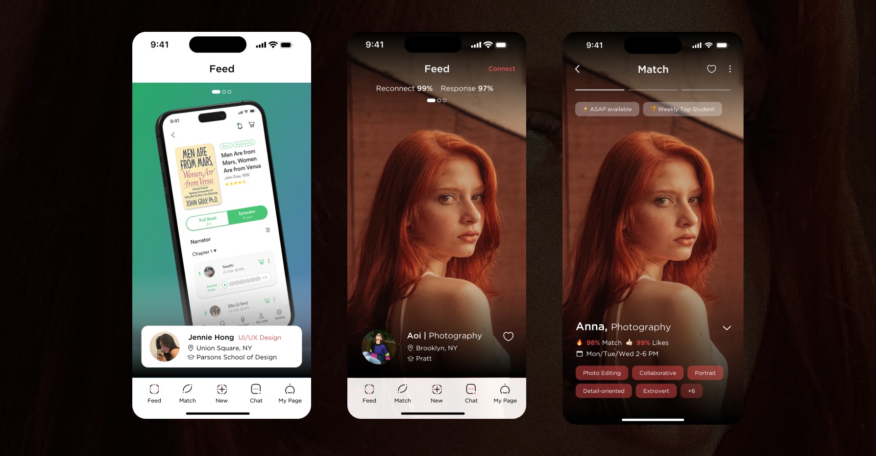
I streamlined the design by removing all distracting elements, including white boxes and profile pictures, and placing all information at the bottom for easy skimming. Red boxes highlight overlapping skills and personalities, making similarities easily noticeable.
Also, I redesigned the progress bar to mimic the Instagram Story format, indicating that the next work is coming soon and can be seen immediately with a tap. I also implemented a badge system, allowing users to quickly check a student's availability and reliability.


Iterations
02
UX writing & Color
02
UX writing & Color
02
UX writing & Color
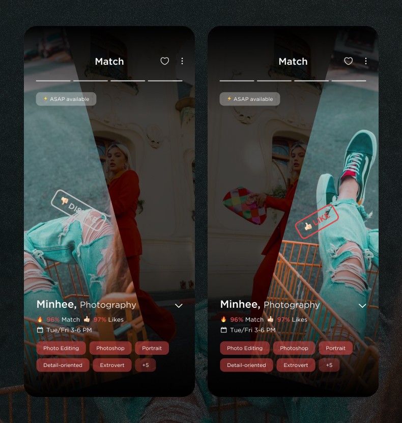
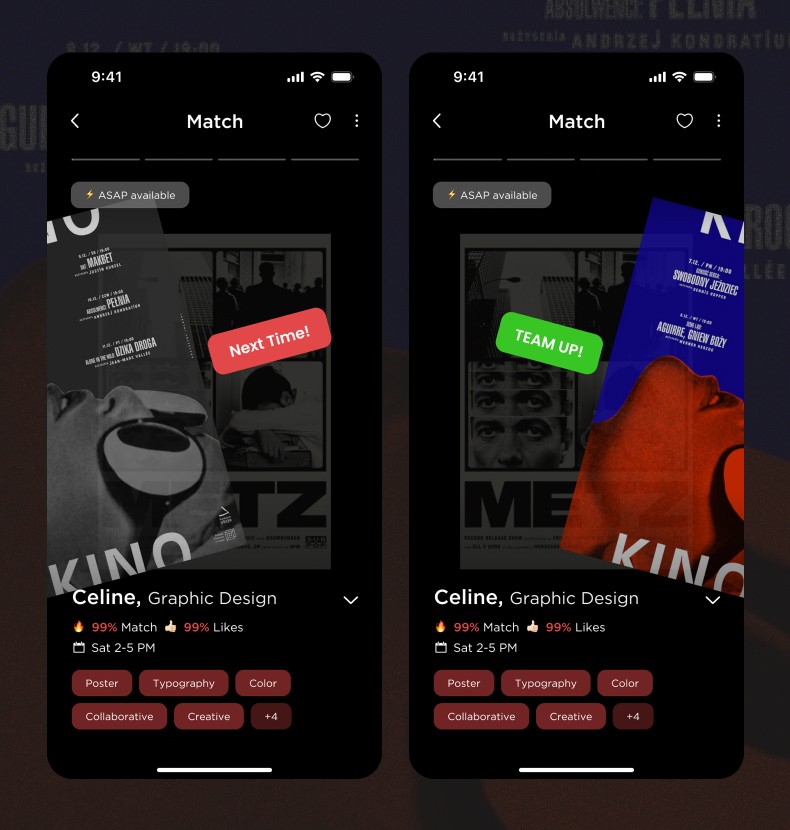
Initially, I used 'Like' and 'Dislike' for swipe actions, but I changed the labels to 'Team Up!' and 'Next Time' to create a more positive and collaborative atmosphere, considering the nuance I wanted to convey.
Additionally, I originally used Colleb red (pinkish red) and grey for swipe actions. However, I switched to green and red based on their widely recognized associations and color theory, as red typically indicates 'no' or a negative response.
[ AS IN ]
[ AS IN ]
[ AS IN ]


[ TO BE ]
[ TO BE ]
[ TO BE ]


final design
01
Quickly find teammates based on your desired skills
01
Quickly find teammates based on your desired skills
01
Quickly find teammates based on your desired skills
Users can get recommended students for collaboration by entering keywords like major and skills. They can enter multiple keywords to improve their match results.
Users can get recommended students for collaboration by entering keywords like major and skills. They can enter multiple keywords to improve their match results.
Users can get recommended students for collaboration by entering keywords like major and skills. They can enter multiple keywords to improve their match results.
02
A recommendation system that considers personality compatibility
02
A recommendation system that considers personality compatibility
02
A recommendation system that considers personality compatibility
Users can choose up to five personalities for their ideal teammate, and the system prioritizes recommendations based on the highest match. This is part of the sign-up process, making it easier by reducing the need to choose personality each time.
Also, users can choose up to five personalities that represent themselves, so they can be recommended to others.
03
Easy and quick exploration through a familiar UI
03
Easy and quick exploration through a familiar UI
03
Easy and quick exploration through a familiar UI
Similar to short-form content on social media, users can quickly browse multiple student works by tapping left or right. The swipe feature, commonly found in dating apps, is also used to clearly and intuitively implement the concept of matching.
Similar to short-form content on social media, users can quickly browse multiple student works by tapping left or right. The swipe feature, commonly found in dating apps, is also used to clearly and intuitively implement the concept of matching.
Similar to short-form content on social media, users can quickly browse multiple student works by tapping left or right. The swipe feature, commonly found in dating apps, is also used to clearly and intuitively implement the concept of matching.
04
An easy view of the profile at a glance
04
An easy view of the profile at a glance
04
An easy view of the profile at a glance
The main sections include personality match rate, ratings, availability, and necessary skills, all designed for quick viewing at a glance. Additionally, students who are ready to collaborate immediately are given badges, prioritizing them in recommendations.
If users want more details about a student, they can click the arrow on the right to view additional information.
05
Project proposals for a fast and smooth teammate search process
05
Project proposals for a fast and smooth teammate search process
05
Project proposals for a fast and smooth teammate search process
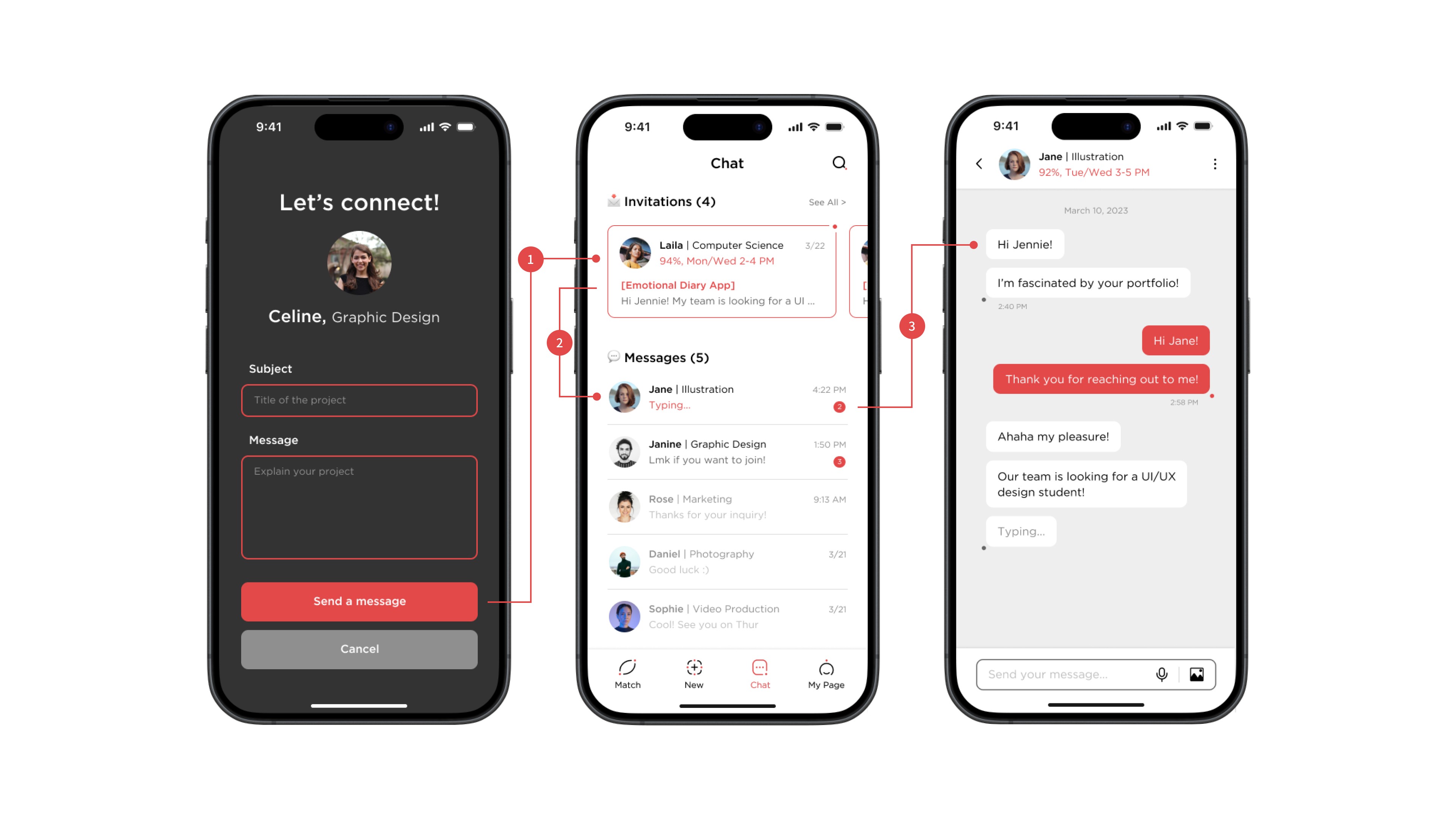
Users can swipe right or click the match button on the detailed page to send a proposal. The proposal must include project details, helping both parties understand the project beforehand, reducing unnecessary conversations, and enabling more efficient collaboration.
Students receiving the proposal must accept it before engaging in mutual conversation to prevent one-sided communication.


takeaway

I came to realize the importance of uncovering the hidden intentions behind phenomena.
I came to realize the importance of uncovering the hidden intentions behind phenomena.
I came to realize the importance of uncovering the hidden intentions behind phenomena.
I discovered that the numerous posters at school are not actually effective for smoothly recruiting teammates and serve only as a secondary method for finding team members outside of students' circles. Through this project, I learned that when approaching a problem, it’s important to recognize and explore the hidden intentions behind human behaviors or phenomena.
I discovered that the numerous posters at school are not actually effective for smoothly recruiting teammates and serve only as a secondary method for finding team members outside of students' circles. Through this project, I learned that when approaching a problem, it’s important to recognize and explore the hidden intentions behind human behaviors or phenomena.
I discovered that the numerous posters at school are not actually effective for smoothly recruiting teammates and serve only as a secondary method for finding team members outside of students' circles. Through this project, I learned that when approaching a problem, it’s important to recognize and explore the hidden intentions behind human behaviors or phenomena.

If I were to work on a project again, I would focus more on exploring team members' personalities.
If I were to work on a project again, I would focus more on exploring team members' personalities.
If I were to work on a project again, I would focus more on exploring team members' personalities.
This time, I focused on aligning users' cultural and generational characteristics with the solution. Reflecting on the project, I believe the personality-based matching concept has the potential to evolve into a unique strategy. If I were to do the project again, I would deepen the trait analysis to improve the effectiveness of the matching process.
This time, I focused on aligning users' cultural and generational characteristics with the solution. Reflecting on the project, I believe the personality-based matching concept has the potential to evolve into a unique strategy. If I were to do the project again, I would deepen the trait analysis to improve the effectiveness of the matching process.
This time, I focused on aligning users' cultural and generational characteristics with the solution. Reflecting on the project, I believe the personality-based matching concept has the potential to evolve into a unique strategy. If I were to do the project again, I would deepen the trait analysis to improve the effectiveness of the matching process.
